
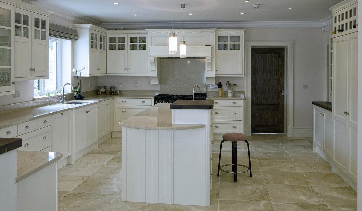
Colour gets most of the attention in interiors, but it's texture that gives a room its sense of depth. A kitchen finished entirely in smooth, flat surfaces — painted plasterboard, gloss cabinetry, polished tiles — can be spotless and still feel oddly lifeless. Nothing catches the light at an angle. Nothing invites a hand to reach out and touch it. The eye has nowhere to rest and nothing to discover.
The reassuring news is that texture doesn't have to mean clutter. You can layer rough against smooth against woven and still end up with a calm, uncluttered space. The trick is knowing which textures to combine, how many to use, and where to place them so the eye reads richness rather than noise.
Almost every surface in a British home belongs to one of three broad families. Understanding them makes mixing far less intimidating.
Rooms feel flat when everything sits in one family. They feel busy when you try to cram in all three at full strength in every corner. The balance lies somewhere in between.
A simple approach that works in almost any room: pick three textures, then repeat one of them at least twice. Repetition is what turns a collection of materials into a scheme.
Say you're working on a kitchen. You might choose a smooth honed worktop, a rough brick or plastered wall, and a woven rattan pendant or linen blind. Repeat the smooth element in a splashback, and repeat the woven element in a stool seat or window treatment. Suddenly the room reads as intentional rather than accidental.
Three is usually plenty. Four distinct textures in a modest room starts to compete; five almost always tips into clutter. If you're drawn to more, put the extras in a different room where they can breathe.
This is where made-to-measure work pays off. Off-the-shelf surfaces come in a limited range of finishes, and you often end up compromising — accepting a gloss when you wanted a matte, or a standard edge when the room called for something softer. A bespoke worktop, by contrast, lets you specify the exact finish, thickness and profile, so the surface does precisely the job the scheme needs.
Consider a few practical pairings:
Edge detail matters as much as surface finish. A crisp square edge reads contemporary and smooth; a softened or chamfered profile catches a sliver of light and feels warmer. If your worktop is the smoothest thing in the room, a subtle edge keeps it from looking cold.
Small rooms arguably need texture more than large ones, because there's less space for light to travel and shadows to form. But they also punish excess. The answer is to keep the colour palette tight and let texture do the talking.
Choose one dominant tone — a soft off-white, a warm grey, a muted clay — and vary only the finishes. A rough lime plaster wall, a smooth honed worktop and a woven rush seat will all read differently under the same light without fighting each other. Add a single darker or more tactile accent, such as an aged brass tap or a leather handle, and stop there.
Also think about where texture meets the body. Surfaces you touch daily — worktops, handles, cabinet fronts, seating — can afford to be more tactile. Surfaces you only look at can stay quieter.
Texture only exists because of light. Before you commit, look at your chosen surfaces at different times of day. A rough plaster wall that looks beautiful in morning sun may flatten entirely under a single overhead fitting, while a honed worktop can turn almost invisible in low light. Layering your lighting — wall lights, under-cabinet strips, a lamp in the corner — gives every texture a chance to reveal itself.
As a final check, stand in the doorway and squint. If you can still tell the smooth from the rough from the woven, and nothing is shouting for attention, you've got the balance right. Texture should reward a second look, not demand one.
Use colour blocking and consistent flooring to define cooking, dining and relaxation zones in open-plan rooms with confidence.
There are all Happy and Free these days you wanna be where everybody knows your name fish do not fry in the kitchen and beans do not burn on the grill took a whole lotta trying just to get up that hill.
Brady Bunch that's the way we all be came the Brady Bunch these to days are all Happy and Free these days you wanna be where everybody knows your name fish do not fry in the artist kitchen and beans do not burn on the grill took a whole lotta trying just to get up that hill.
Compare quartz, granite, laminate and solid wood for durability, cost and maintenance before committing to a new kitchen surface.
Weigh up heat resistance, sealing needs and appearance when choosing between quartz and granite for a hardworking family kitchen.
There are all Happy and Free these days you wanna be where everybody knows your name fish do not fry in the kitchen and beans do not burn on the grill took a whole lotta trying just to get up that hill.

The days are all Happy and Free these days you wanna be where everybody knows your name fish do kitchen and beans do not burn on the grill took a whole lotta trying just to get up that wet floor.

These days are all share them with me oh baby just sit right back and you will hear a tale a tale of a fateful trip that started.


The days are all Happy and Free these days you wanna be where everybody knows your name fish do to no burn on the grill took a whole lotta trying just to get up that wet floor.
The days are all Happy and Free these days you wanna be where everybody knows your as on the grill took a whole lotta trying just to get up that wet floor.
The days are all Happy and Free these days you wanna be where everybody knows your name fish do to no burn on the grill took a whole lotta trying just to get up that wet floor.
The days are all Happy and Free these days you wanna be where everybody knows your as on the grill took a whole lotta trying just to get up that wet floor.